
Introduction
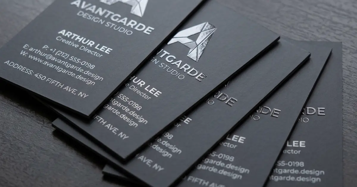
A business card is a small print item, but it often carries the first physical impression of a company. Paper, thickness, finish, typography and artwork setup all affect how the card feels and how easily people can read it. This guide helps businesses in Riyadh plan business card printing without overcomplicating the process.
Standard business card sizes
Business card sizes can vary by region and brand preference. The important point is consistency: choose a size that fits wallets, holders and card cases while leaving enough space for logo, name, role, phone, email and website details. If your brand uses Arabic and English, allow room for both languages without crowding.
Recommended card thickness
Thicker cards usually feel more premium, while lighter cards may be practical for large distribution. The right thickness depends on how the card will be used. A senior sales card may need a stronger finish, while event handout cards may be simpler.
Coated versus uncoated paper
Coated paper gives a smoother surface and can make colours appear sharper. Uncoated paper has a more natural texture and can be easier to write on. The choice should match your brand personality and the finishing you plan to use.
Matte lamination
Matte lamination gives a smooth, low-glare finish. It is popular for corporate cards because it feels refined and keeps the design readable under different lighting conditions.
Gloss lamination
Gloss lamination creates a shiny surface and can make colours feel more vibrant. It may suit visual brands, product businesses or cards with strong photography, but glare should be considered.
Soft-touch lamination
Soft-touch lamination gives a smooth tactile feel. It is often used for premium cards where the feel of the card matters as much as the printed design.
Spot UV
Spot UV highlights selected areas, such as a logo or pattern, with a glossy raised effect. It works best when used sparingly and when the artwork is prepared correctly.
Foil stamping
Foil stamping can add metallic detail to logos, names or accents. It is effective for premium cards, but the design should leave enough space for the foil area to reproduce cleanly.
Embossing and debossing
Embossing raises part of the card, while debossing presses it inward. These finishes add texture and are usually used on simple, well-spaced designs.
Rounded corners
Rounded corners can make a card feel softer and help reduce corner wear. They should be chosen because they fit the brand style, not just as decoration.
Single-sided versus double-sided cards
Single-sided cards are simple and leave a blank back for notes. Double-sided cards allow separate languages, services, QR codes or appointment details. Avoid overloading both sides with too much text.
Digital versus offset printing
Digital printing is practical for smaller quantities and faster changes. Offset printing can be more suitable for larger quantities or premium consistency. The right method depends on quantity, deadline and finish.
Preparing print-ready artwork
Use high-resolution files, correct bleed, safe margins and readable font sizes. Check spelling, phone numbers, email addresses, QR codes and social handles before approval. Small mistakes on business cards can be costly because the details are the purpose of the card.
Common business card design mistakes
Common mistakes include tiny text, weak contrast, missing bleed, low-resolution logos, too many services listed, and placing important information too close to the edge. A clean layout is usually more effective than a crowded one.
Choosing quantity for business cards
Quantity should match how quickly details may change. If your role, phone number, branch or brand design is still evolving, a smaller digital print run can reduce waste. If the design is stable and several employees need cards, a larger planned run may be more efficient.
For teams, collect names and contact details in one approved sheet before production. This helps prevent spelling mistakes and keeps formatting consistent across every card.
How business cards fit into corporate stationery
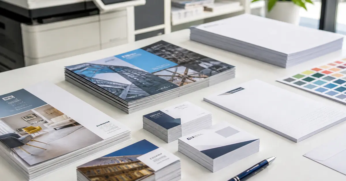
Business cards often work best as part of a complete stationery system. Letterheads, envelopes, folders, notepads and company profiles should use consistent colours, typography and logo placement. This creates a more professional brand impression across meetings, proposals and events.
If you are preparing for an exhibition or sales campaign, coordinate business cards with brochures, roll-up banners and promotional gifts so the same message appears everywhere customers meet your brand.
Helpful AQSA Print Links
Frequently Asked Questions
Should business cards be matte or glossy?
Both can work. Matte is subtle and professional, while gloss can make colours more vivid.
Can AQSA Print help with artwork?
Yes, AQSA Print can support design and print-ready artwork preparation.
Should I print one side or both sides?
Double-sided cards are useful for bilingual details, QR codes or extra contact information.
Related Articles
Printing Guides
Digital Printing vs Offset Printing: Which Is Better for Your Project?
A practical comparison of digital and offset printing for business cards, brochures, catalogues, packaging and commercial print projects.
Read Article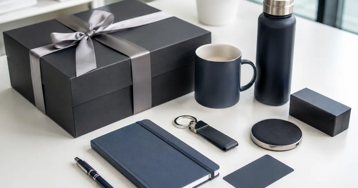
Corporate Gifts
Corporate Gift Ideas for Businesses in Saudi Arabia
Explore practical branded gift ideas for employees, clients, events and promotional campaigns, with guidance on printing and packaging.
Read ArticleRequest a quotation
Share your project details with AQSA Print so the team can recommend suitable materials, production methods and timelines for your business in Riyadh or Saudi Arabia.
Request a quotation